線形グラデーション Linear gradient
線形グラデーションについて
グラデーションはbackgroundまたはbackground-imageプロパティにlinear-gradient関数を設定します。
開始位置と終了位置は省略することができ、省略した場合、開始位置は0、終了位置は100%が初期値として設定されます。
なお、旧Webkit仕様では、from関数は開始位置を0、to関数は終了位置を1という仕様になっています。
開始と終了位置を指定したい場合はcolor-stop関数を使用します。
構文
位置の省略
background:linear-gradient(方向または角度, 開始位置, 終了位置);旧Webkit仕様:background:-webkit-gradient(linear, 開始方向, 終了方向, from(開始色), to(終了色));
位置の指定あり
background:linear-gradient(方向または角度, 開始色 開始位置, 終了色 終了位置);旧Webkit仕様:background:-webkit-gradient(linear, 開始方向, 終了方向, color-stop(開始位置, 開始色), color-stop(終了位置, 終了色));
| 方向 | |||
|---|---|---|---|
| 名称 | 設定値 | 設定値(toなし) | 設定値 旧webkit仕様 |
| 上→下 | to bottom | top |
開始方向:left top 終了方向:left bottom |
| 下→上 | to top | bottom |
開始方向:left bottom 終了方向:left top |
| 左→右 | to right | left |
開始方向:left top 終了方向:right top |
| 右→左 | to left | right |
開始方向:right top 終了方向:left top |
| 左上→右下 | to right bottom | left top |
開始方向:left top 終了方向:right bottom |
| 右上→左下 | to left bottom | right bottom |
開始方向:right top 終了方向:left bottom |
角度
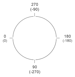
角度の指定は単位をdegとして指定します。
角度はxの左側を0とし、反時計回りを正、時計回りを負として指定することができます。
サンプル
縦方向
横方向
斜め
角度(60度)
CSS
グラデーションポイントの追加
グラデーションの途中にポイントを追加して色を挿入することができます。
旧Webkit仕様ではcolor-stop関数を使用します。
位置を省略した場合は、均等に配置されます(ただし、旧Webkit仕様でcolor-stop関数を使用している場合は、省略することができません)。
サンプルコードでは旧Webkit仕様は色の開始と終了位置にもcolor-stop関数を使用していますが、色の開始と終了位置については、from関数とto関数でも可能です。
構文
background:linear-gradient(方向, 開始色 開始位置, 途中色 途中位置, 終了色 終了位置);旧Webkit仕様:background:-webkit-gradient(linear, 開始方向, 終了方向, color-stop(開始位置, 開始色), color-stop(途中位置, 途中色), color-stop(終了位置, 終了色));
サンプル
縦方向
横方向
斜め
CSS
グラデーションの複数指定
Multiple backgroundsとしての指定ですが、カンマ区切りで指定することで、複数のグラデーションを1つの要素で使用することができます。
CSS